Why this matters
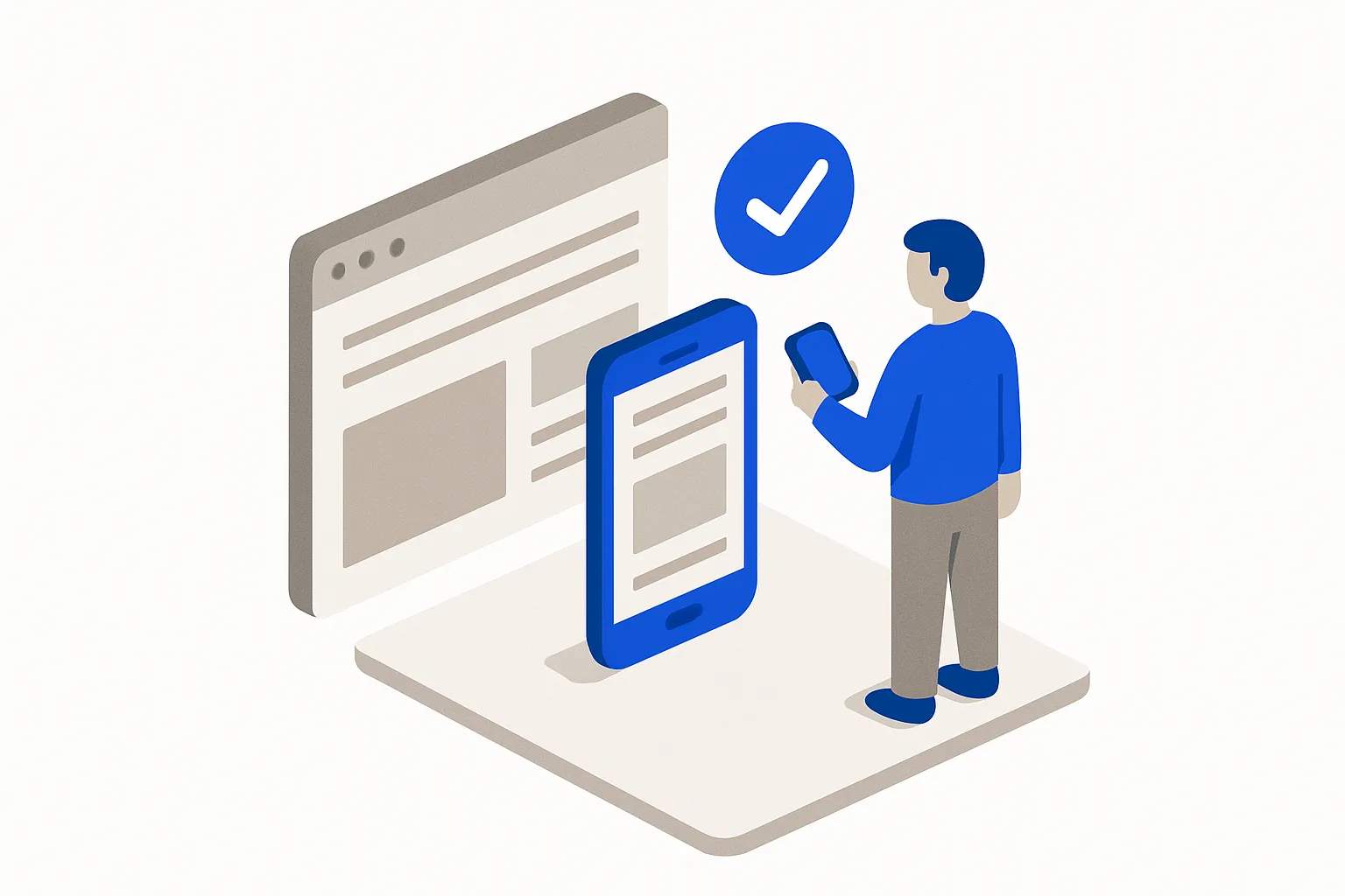
Roughly six in ten web visits worldwide now come from phones (per StatCounter), and for local businesses the share of buying-intent visits is often higher. Google also indexes the mobile version of your site first. A site you've only ever viewed on a laptop is a site you've never seen the way customers see it.
What "done" looks like
- You've opened every page on a real phone
- Text is readable without pinch-zooming; buttons are tappable with a thumb
- The contact form and click-to-call both work on mobile
- Pages load acceptably on a cellular connection, not just office Wi-Fi
How to do it
- Walk every page on your actual phone. Note anything you squint at, mis-tap, or wait for.
- Run the thumb test. Buttons and links need room; cramped tap targets cause mis-taps.
- Submit your own form and tap your own number. Confirm the call connects and the form arrives.
- Test on cellular, off Wi-Fi. Then run Google's free PageSpeed Insights and fix the worst offenders, usually oversized images.
- Check the menu and popups. Mobile menus that don't open and popups that can't be dismissed are conversion killers.
- Repeat after every meaningful edit. Layouts that look fine on desktop routinely break on small screens.
Common mistakes
- Testing only in a desktop browser's "mobile view" and never on a device
- Full-screen popups that trap mobile visitors
- Multi-megabyte images that feel instant on Wi-Fi and glacial on cellular
Real-world examples
- StatCounter's public data has shown mobile at roughly 60% or more of global web traffic in recent years. The default visitor is on a phone.
- Google's shift to mobile-first indexing means Google primarily uses the mobile version's content for indexing and ranking, a documented reason mobile problems are search problems.
From a founder's point of view
The desktop version is the founder's view; the phone version is the customer's. Reviewing only the desktop site is reviewing a store layout no customer will ever walk through.
Rule of thumb
If you haven't tapped through every page on your own phone this month, assume something is broken on mobile.